- Google Analytics
Looker Studio (formerly Google Data Studio) – Plethora of Reporting
16 Feb 2024
The beauty of Looker Studio is that it can be used to create any marketing report or dashboard. If you’re suffering from blank page syndrome, you might want to start by learning about the different types of custom reports that Looker Studio can generate.
1. Introduction
The beauty of Looker Studio is that it can be used to create any kind of marketing report or dashboard. If you’re suffering from blank page syndrome, start by exploring the importance of Looker Studio dashboard for reporting.
Before diving into specifics, check out our blog to understand why Looker Studio is important for reporting and visualisation.
2. Why do you need a Dashboard?
Most businesses want more than just raw traffic data. The best dashboards pull information from multiple sources to provide insights across your marketing funnel—covering SEO, social media, ecommerce, and more.
A key feature is that you can tailor analytics dashboards for different teams. For example, your web development team can see detailed visitor information, while your marketing team can focus on lead generation and conversions.
Now, let’s explore the different report templates you can create using Looker Studio.
3. Google Analytics Reports
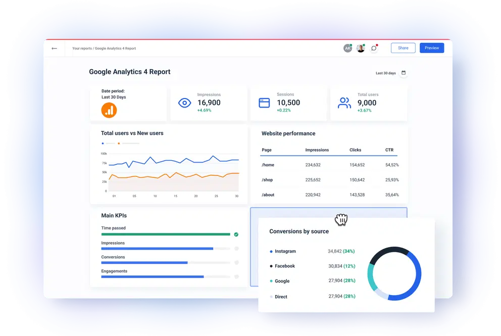
Google Analytics gives you a lot of information about your site’s performance, including visits per page, returning visitors, top landing pages, active users, and traffic sources. These Google Analytics reports are excellent for basic tracking, but you’ll need a dashboard if you want to see several metrics in one place.
Custom dashboards allow you to tailor precisely what information you view and centralise all of your key metrics.
Without having to develop a bunch of custom reports, a smart Google Analytics dashboard aggregates information from throughout your analytics account and shows them in an easy-to-understand style.
You may even integrate data from sources other than Google Analytics or web reporting and publish the findings for maximum visibility.
4. Ads Comparison Reports
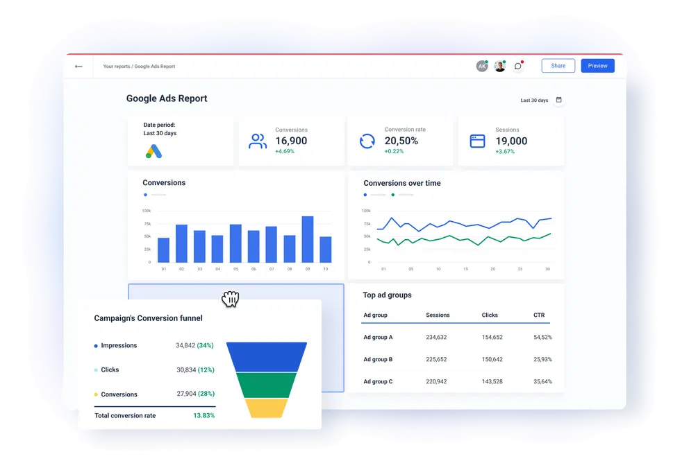
The harsh reality is that your client may not be as knowledgeable about paid advertising as you are. What they’re usually interested in is how much you’re paying and what you’re getting in return. If that’s the case, you may mix reporting templates for Facebook Ads, Google Ads, LinkedIn Ads comparison. It acts as a graphic executive summary that you should surely supplement with a few lines of textual commentary.
5. YouTube Channel Reports
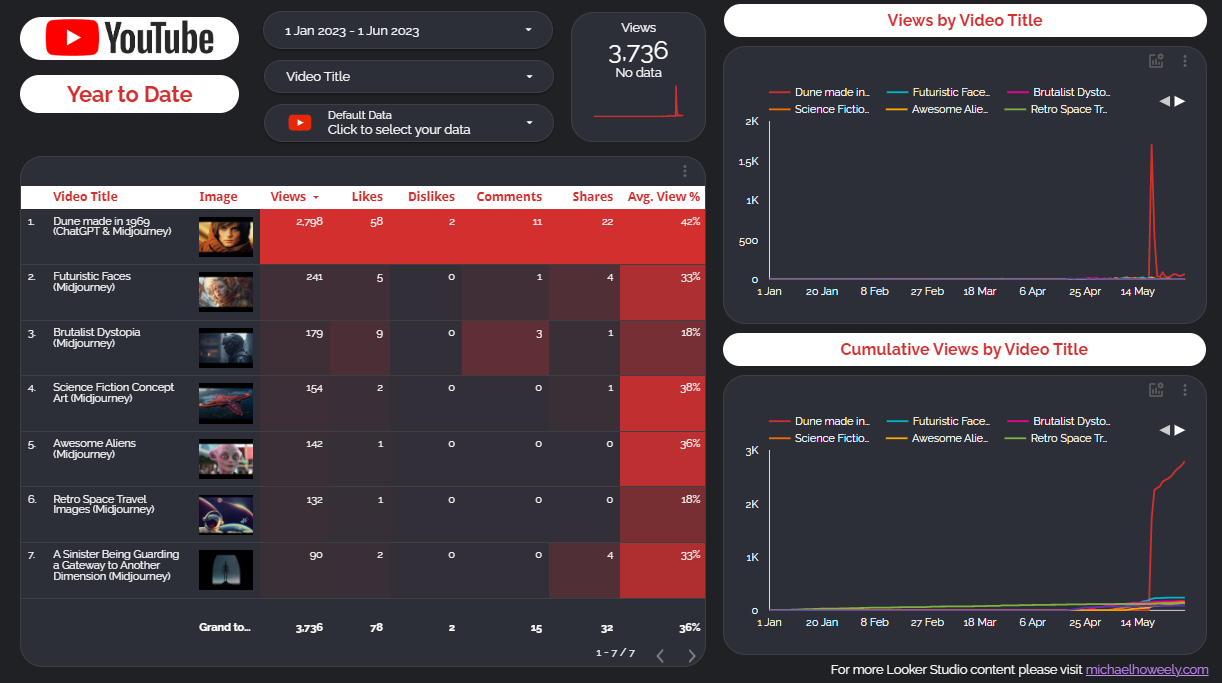
Every YouTube account manager understands how time-consuming it can be to generate reports or switch between accounts. You’d spend hours double-checking the information you’re ready to give your client.
Imagine being able to construct dashboards in minutes and managing several accounts from a single dashboard.
It can help you track crucial indicators and generate reports based on how well your efforts are performing.
It also allows your clients to track the progress of your campaign in real-time. This allows them to keep track of their video marketing performance while on the move.
Monitoring and analysing the correct YouTube analytics is critical to your campaign’s success. You must be able to identify critical metrics that may be used to assess the performance of your client’s YouTube account and the videos that are shown on it.
6. Google Search Console Reports
Another of Google’s services and tools, Google Search Console, allows you to monitor and control your website’s optimisation and indexing. Despite the fact that your site will always be available on Google, Google Search Console allows you to view how Google perceives your site, which may help you optimise and enhance its search result ranking. Your Google Search Console dashboard allows you to track your progress over time and constantly optimise your website.
Clients enjoy looking at Google Search Console data, but they despise having to go through line after line of raw Google Sheet data. Comprehensive charts and graphs present key metrics from Google Search Console in an easy-to-understand and manageable style.
Investigate CTR for useful information.
When high-ranking keywords have a low CTR, it’s usually a sign that the page title or meta description isn’t well-optimized.
Make changes to those things for quick and easy traffic gains.
Crawl mistakes may have a significant influence on your client’s rankings and user experience. With a simple, easy-to-use dashboard, you can keep track of crawl problems on a regular basis.
7. Reports Customization
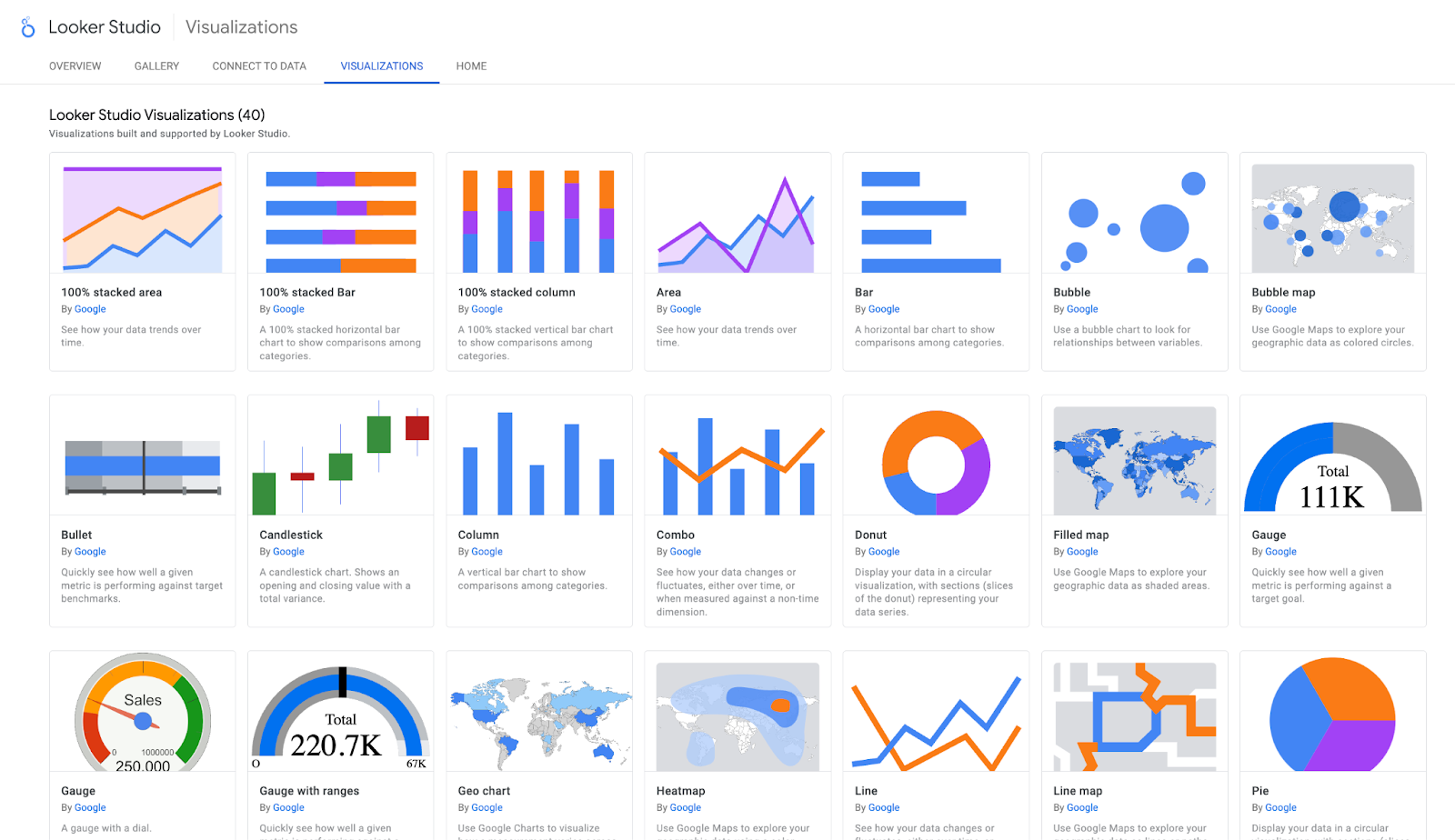
Types of Charts
You’re now ready to create a chart, which is the most visible part of a Looker Studio Dashboard. The “Add Chart” dropdown is located across the toolbar, and it allows you to pick the data you wish to use. After you’ve decided on a chart, use the right sidebar to add dimensions and metrics. Don’t worry if you choose the wrong chart; you can easily modify it using the right sidebar editor. You can include Pivot tables, Bar Charts, Scatter plots, and many more charts from the available thirteen options.
8. Filters
A filter can be used to include or exclude data based on its dimension or metric.
Let’s assume you just wanted to include “Pageviews” from the United States in your top website page listing.
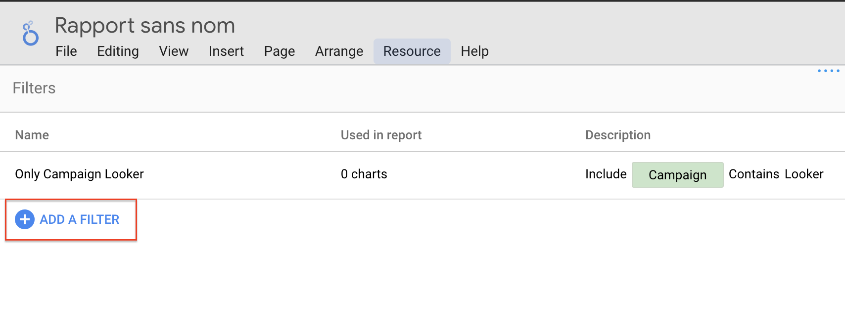
You’d make a filter with the following logic: Included is the terms Country, Equal to Australia. Include/exclude, dimension/metric, Match (equal to, starts with, contains, is null, etc.), and Value are required for each filter.
You have two options for taking your filters to the next level. For starters, each filter can have many lines of logically connected by “And” or “Or.” For example, if you want to include everyone from the United States as well as a mobile device in your chart. Perhaps anybody from the United States or Australia should be included. You may build numerous lters and apply them to the same chart if you want to keep your filters basic.
10. Segments
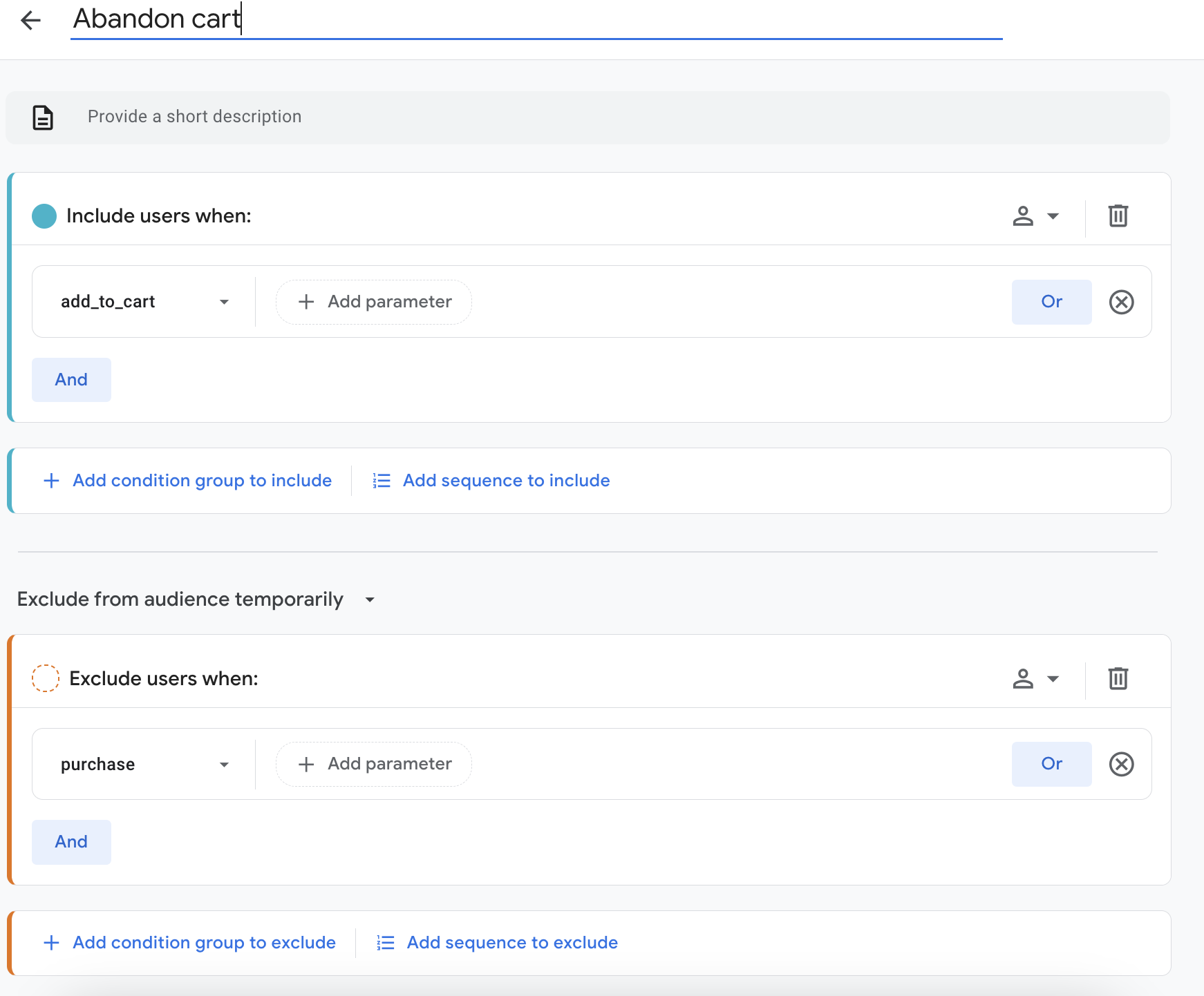
Google Analytics data is the only data that can be segmented. Several have already been produced by Google and may be used to your Looker Studio charts. To put it another way, think of these as pre-made filters. Users are categorised by traffic type, number of sessions, device, and other factors. Additionally, either in Google Analytics or Google Data Studio, you may build custom segments.
11. Date - Range Controls
By selecting a date range in the Data Editor, you may display historical data on Looker Studio charts. This appears as a separate column in tables as a percent Delta, or percent change. It appears as a little red or green arrow with a percent change besides it on other charts.
12. Drill Down
Another alternative is to dig down to a certain dimension. Only a few dimensions with a hierarchical structure, such as Geodata, are suitable for drilling down. “Continent,” “Sub-continent,” “Country,” and “City” are all terms used by Google. Instead of putting all of those numbers on a chart, you could use a drill down to bring them all together. In this scenario, Looker Studio will only show one dimension but will provide arrows above the chart to enable users to dive down further into the data. This, like optional metrics, keeps your chart tidy while yet providing a lot of information to your viewers.
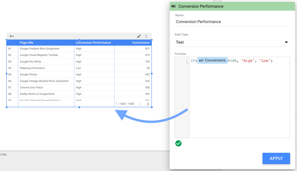
13. Calculated / Custom Field
A calculated field is a designation given by Looker Studio to a collection of data that results in a new dimension or metric. This is referred to as a formula in Google Sheet. The calculated field has a syntax, logic, and set of instructions accessible. We’ll keep it basic here, but when you’re working with raw data in Looker Studio, such as a spreadsheet or an eCommerce data connection, you may do many comparable operations to Google Sheet
14. Here's what you've learnt:
Understanding why Looker Studio is important for reporting is the first step to transforming how you track, visualise, and present your data. With its wide range of customisable features and the ability to pull in data from multiple sources, Looker Studio is an essential tool for creating effective, actionable dashboards that improves decision-making.
15. FAQ
Q1. What is Looker Studio and why is it important for reporting?
Looker Studio (previously Google Data Studio) is a free tool that allows you to connect data from multiple sources and turn it into interactive dashboards and reports. It’s valuable because it simplifies raw data into easy-to-read charts, helping teams make better decisions quickly.
Q2. What types of reports can I create in Looker Studio?
You can create a variety of reports including Google Analytics dashboards, paid ads comparison reports (Google Ads, Facebook Ads, LinkedIn Ads), YouTube channel reports, and Google Search Console reports. These can be customised for different teams, from marketing to development.
Q3. Can I customise reports in Looker Studio?
Yes. Looker Studio offers flexibility with features like custom charts (bar, scatter, pivot tables, etc.), filters, calculated fields, drill-down options, date-range controls, and segmentation. This makes it easy to tailor dashboards to your business goals and audience needs.
Q4. How does Looker Studio handle multiple data sources?
Looker Studio allows you to integrate and blend data from multiple platforms such as Google Analytics, Search Console, YouTube, Ads, and spreadsheets into a single dashboard. This helps you track performance across your entire digital ecosystem in one place.
Q5. Who should use Looker Studio?
Looker Studio is useful for businesses, agencies, and teams who need to visualise and share marketing, sales, or website performance data. Whether you’re a marketer monitoring campaign ROI, a developer analysing site traffic, or a manager tracking KPIs, Looker Studio provides tailored dashboards for each use case.


