- CRO
How to Write CTAs That Convert Without Sounding Salesy
01 Nov 2025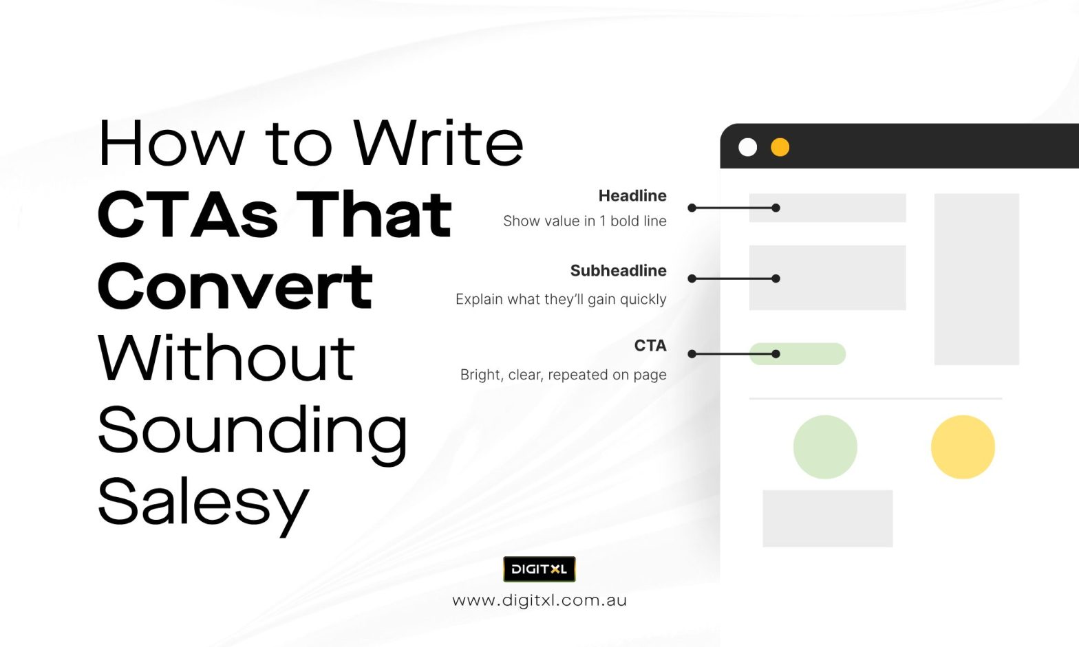
Writing a call to action looks simple. The space is small, the words are few, yet the outcome depends on how those words land. Each phrase has to signal confidence, relevance, and timing. A single misplaced verb can change the rhythm of a page.
At DIGITXL, we see CTAs as the final expression of a larger story. They guide people through a decision that has already formed in their minds. When written and placed with care, they feel like a continuation of intent rather than a demand for attention.
Across eCommerce and B2B projects, clear and considerate CTAs consistently outperform dramatic ones. The most effective work because they mirror real human communication direct, calm, and unforced.
1. Understand the Setting Before Writing Anything
A CTA only works inside a specific context. Before writing, examine where the user is in their journey. The question changes depending on whether they are discovering, comparing, or ready to act.
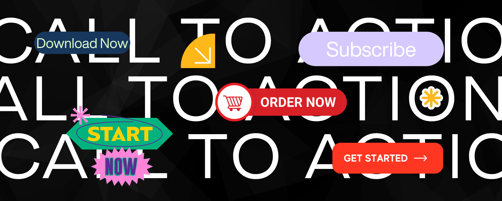
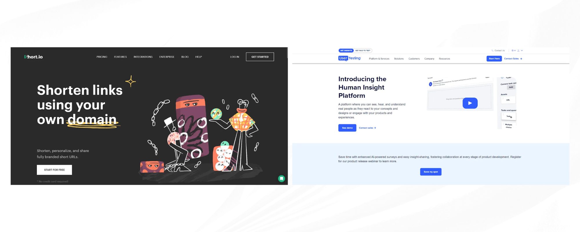
In eCommerce, discovery CTAs often sound exploratory:
“View details,” “See options,” “Check availability.”
These keep the conversation light while still encouraging movement.
In B2B, discovery CTAs highlight access or insight:
“Explore the platform,” “Read the report,” “Watch the demo.”
When users move closer to purchase, direction becomes firmer:
“Add to cart,” “Proceed to checkout,” “Request a proposal.”
Context defines tone. By matching the stage of intent, a brand builds momentum instead of resistance.
2. Write in the Natural Rhythm of Speech
Good CTA language reads like something a person would actually say. Short sentences with clear verbs hold attention better than jargon. Simple language performs best in conversion rate optimisation because it lowers cognitive effort. Every extra word delays the decision.
Compare:
- “Initiate your complimentary evaluation.”
- “Start your free trial.”
Both express the same outcome, yet the second line feels lighter and more trustworthy.
Testing across industries shows that conversational phrasing consistently outperforms corporate tone. It invites participation rather than compliance, which directly improves engagement metrics in any CRO agency in Australia campaign.
3. Let Tone Carry Trust
Tone communicates intent faster than wording. Friendly phrasing signals safety; measured phrasing signals professionalism. The right balance depends on brand identity and audience expectation.
For retail, warmth often helps:
“Let’s get started,” “Try it, no commitment.”
For B2B, clarity and authority carry more weight:
“Book a consultation,” “Get your personalised strategy.”
Each approach works when the tone aligns with the promise of the page. Consistency between brand voice and CTA tone strengthens trust, which sits at the centre of conversion rate optimisation.
4. Place CTAs Where Attention Peaks
Placement matters as much as phrasing. A CTA should appear at the moment when understanding turns into readiness.
For product pages, this point arrives after value and reassurance are visible. Users want confirmation that the offer meets their need before they decide. Positioning the button too early interrupts evaluation; positioning it too late risks fatigue.
In long B2B pages, repeating the CTA at natural intervals sustains accessibility without crowding the design. The first CTA handles early curiosity, while later placements serve validation.
Well-timed placement improves interaction without requiring visual tricks or urgency banners.
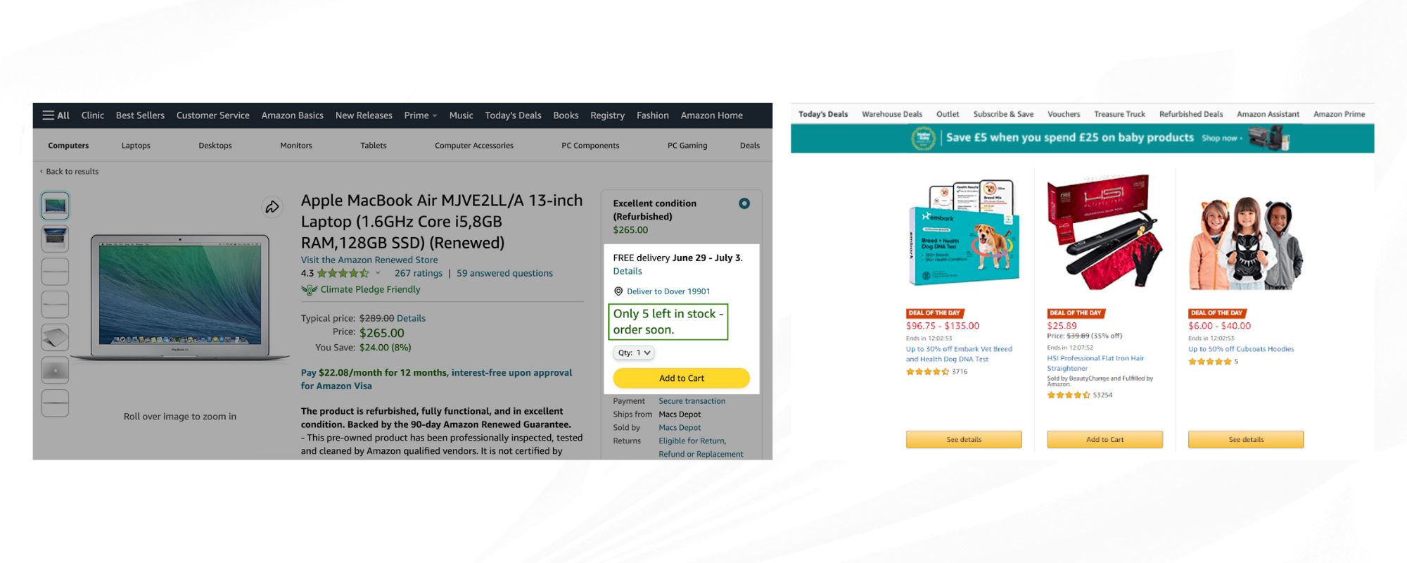
5. Surround the CTA With Clarity
The elements around a CTA influence trust. Microcopy, layout, and supporting signals guide the emotional side of a decision.
Add reassurance where uncertainty might appear:
“Secure payment,” “Cancel anytime,” “No hidden charges.”
Use short statements that describe what happens after clicking:
“Receive your download instantly,” “Schedule confirmation within a day.”
These messages anchor expectations. They turn the abstract idea of “clicking a button” into a concrete, low-risk action.
During our audits, this adjustment consistently produces measurable uplift across client funnels. The technique reflects the practical mindset of leading conversion rate optimisation consultants who focus on behaviour rather than aesthetics.
6. Align Design and Copy
Visual hierarchy should guide the eye toward the desired action. Whitespace, colour contrast, and alignment determine whether the button feels natural or intrusive.
Limit each screen to one dominant action. Secondary links can exist, but they should appear visually lighter. When multiple strong CTAs share a screen, users pause to decide which path to follow and often choose neither.
On mobile layouts, space is tighter, so balance becomes even more important. Allow breathing room above and below the button. The eye recognises separation as significance.
A clean structure improves comprehension speed, which directly supports conversion rate optimisation goals.
7. Test Words Before Colours
Design experiments draw attention, yet the phrasing itself holds the deeper insight. Testing small variations of microcopy reveals how audiences interpret tone.
Examples that often influence results:
- “Sign up free” vs. “Create your account.”
- “Book a call” vs. “Schedule time with our team.”
- “Add to bag” vs. “Buy now.”
Each carries a different emotional temperature. Tracking completion rates after these changes tells you which style fits your audience’s comfort level. This practical testing approach remains central to the methodology of any skilled CRO agency because it blends qualitative understanding with measurable data.
8. Present Urgency as Information
Deadlines and scarcity can motivate action when they communicate real conditions. The language should describe availability rather than impose pressure.
Accurate urgency examples:
- “Order by 2 pm for same-day dispatch.”
- “Enrolments close Friday.”
- “Two seats left for the live session.”
These statements inform rather than provoke. They maintain credibility while still prompting timely decisions. Sustained credibility contributes more to long-term conversion performance than short-term spikes generated through exaggerated urgency.
9. Maintain a Continuous Review Cycle
CTAs evolve with audience expectations. Words that once felt current can start to sound mechanical as phrasing trends shift. Schedule periodic reviews to confirm tone, placement, and clarity still align with behaviour data.
Fresh analysis ensures that conversion rate optimisation remains a living process rather than a one-off task. Continuous observation allows small adjustments that preserve momentum and protect brand trust.
10. So,
A well-written CTA speaks with confidence and ease. It connects information with intention and moves the user naturally through the next step. The craft lies in attention to timing, tone, and design harmony.
At DIGITXL, our team applies these principles across every project. Each call to action becomes part of a wider narrative about clarity and relevance. As a specialist CRO agency in Australia, we see measurable growth when clients replace volume tactics with precision communication.
Conversion performance improves when a brand respects the reader’s pace. Clarity converts; authenticity sustains.

Recent Posts

How to Optimise Your Blog Content for SEO

How to monitor your site traffic with analytics?

What is the 80/20 rule for SEO?
Case Studies
Business News Australia
On Track Meals


