Data Visualisation Experts
Empower Decision-Making:
Interactive Dashboards, Actionable Insights.
Partner with our analysts and reporting specialists to craft interactive dashboards for measuring digital and marketing performance. Seamlessly integrate and unify diverse data channels to gain a comprehensive view of your business metrics.
Google Reviews
Get Your Free Reporting Audit
Worth $2000
Google Reviews
Our Data Visualisation Services
“It may be quite intimidating for businesses to learn the data in order to make informed decisions in this vast ocean of information that the internet holds. Companies might lose a lot of money or fall behind their competitors if they don’t know where to start, how CRO influences the brand, and how to leverage it. We want to assist you here by reducing the noise and presenting the genuine stories that your data was attempting to tell you.”
Tapan Patel (Founder – DigitXL)

Digital Performance Dashboards
At DigitXL, we specialise in crafting top-tier interactive dashboards tailored to your digital performance needs. Our expertise lies in seamlessly integrating data from various sources, enabling users to delve deep into comprehensive analyses of individual data streams.
At DigitXL, we specialise in crafting top-tier interactive dashboards tailored to your digital performance needs. Our expertise lies in seamlessly integrating data from various sources, enabling users to delve deep into comprehensive analyses of individual data streams.

Marketing Analytics Dashboards
We can create marketing KPI (Key Performance Indicators) dashboards as an analytics tool for marketing and sales teams. It allows you to track and report on online marketing performance which in turn informs marketing strategy and how to achieve business objectives.
We can create marketing KPI (Key Performance Indicators) dashboards as an analytics tool for marketing and sales teams. It allows you to track and report on online marketing performance which in turn informs marketing strategy and how to achieve business objectives.

BI Implementation and Reporting
Our experts have vast experience deploying enterprise-wide data analytics systems and optimising current systems. We can do full-scale installations, modifications, report automation, technical updates and setups, and design for self-service across the organisation.
Our experts have vast experience deploying enterprise-wide data analytics systems and optimising current systems. We can do full-scale installations, modifications, report automation, technical updates and setups, and design for self-service across the organisation.

Mobile app Dashboards
Our Mobile App Dashboard gives you a high-level perspective of how your app is working, with widget-based overviews highlighting where requests originate as well as a range of crucial performance data. We also compile a collection of aggregated usage data by device, carrier, connection type, operating system version, app version, and more.
Our Mobile App Dashboard gives you a high-level perspective of how your app is working, with widget-based overviews highlighting where requests originate as well as a range of crucial performance data. We also compile a collection of aggregated usage data by device, carrier, connection type, operating system version, app version, and more.

eCommerce Dashboards
The e-commerce dashboard is a real-time visual representation of your store’s most valuable metrics and KPIs. We help you keep track of important eCommerce metrics like average order value, conversion rate, revenue, revenue by channel, transactions, users, etc. to gain a deeper understanding of how visitors are using your e-commerce website.
The e-commerce dashboard is a real-time visual representation of your store’s most valuable metrics and KPIs. We help you keep track of important eCommerce metrics like average order value, conversion rate, revenue, revenue by channel, transactions, users, etc. to gain a deeper understanding of how visitors are using your e-commerce website.
How Digitxl Collaborates with Your Team?
- We help you analyse complex streams of data, insights and results from multiple channels.
- We make it easy for you to monitor goals and results, identify opportunities, predict demand, and arrive at the right decision by creating interactive visual displays.
- We create high-quality Business Intelligence (BI) dashboards for you to easily access information all in one place.
- We help you in ensuring smooth operations since decisions are now backed by real-time data, and you are no longer shooting in the dark or anticipating results based on outdated or incorrect data.
Over 100+ businesses of all sizes trust us.


FAQs
No one can anticipate that everyone will comprehend data analysis in large data sets as well as data analysts do because it is a challenging procedure. The simplest approach to explain analytics results to anyone is through data visualisation. You can speed up your business by properly visualising information.
While the specific tools may vary, DigitXL often uses leading platforms like Tableau and Power BI, along with custom-built applications, to deliver powerful and personalised data solutions.
Getting started is simple. Reach out via the contact form on DigitXL’s website or give the support team a call. An initial discussion will help clarify your objectives and determine the best strategy going forward.
Timelines vary depending on the complexity and scope of the project. After an initial consultation, DigitXL will provide a tailored timeline that aligns with your project’s specific requirements.
Yes, training sessions are available to ensure your team can confidently use the visualisation tools. Be sure to discuss available training options during your initial meetings with DigitXL.
Absolutely! DigitXL is highly experienced in seamlessly integrating data visualisation tools with existing infrastructure, helping improve the efficiency and connectivity of your data management processes.
While not limited to specific industries, DigitXL commonly works with sectors such as finance, healthcare, marketing, and retail. Get in touch with the team to explore their experience in your particular field.
Pricing is based on the intricacy and scale of the project. It’s best to speak directly with DigitXL to discuss your needs and receive a personalised quote.
While client confidentiality is always respected, DigitXL may be able to share case studies or previous examples to showcase their capabilities. Speak with the team to learn more.
Clients Feedback That You Can Trust
Our Digitxl consultant has helped us to automate our Adobe Analytics & datalayer implementation by working with our DevOps teams. Data quality has improved dramatically with our new event-based datalayer, helping us to build trust in our data & confidently share the insights with our teams.

Damanpreet Kaur
Digital Analytics Lead
Improved Our Digital Data & Analytics Substantially!
I highly recommend DIGITXL for their outstanding analytics expertise, strategic thinking, and dedication to meeting customer requirements. Tapan and his team at DIGITXL have a comprehensive approach that aligns with business/campaign objectives.
Yannick Pierre
Head of Digital
Detailed Visibility On Our Ecommerce Sales Funnel & User Interactions!
Digitxl's consulting in Adobe Analytics reporting and playbook designs has been invaluable. Truly appreciate the expertise and hands-on approach!
Sakshi Sukhla
Digital Analytics Lead
Very Detailed Expertise In Data Collection & Adobe Analytics!
Our service from Tapan and the DigitXL team has been outstanding. Very professional and respectful service and treatment of our team while managing expectations of executive management and providing genuine, research based feedback and results and coaching for the whole team.

Abbey Cooper
Marketing Director
Digitxl’s Professionalism & Approach Is Outstanding!
Our ecommerce team has greatly benefited with the engagement with Digitxl team. They have tagged our website with right Google Analytics events, enabling detailed analysis on our users car abandonment rates. The Data Studio dashboard has really simplified the reporting process, proving timely insights to entire team. We are really happy with the consultation and prompt support provided by the team.

Bec Wilson
Founder & CEO
We Love The Insights From Our Looker Studio Dashboards!
Digitxl team has done a fantastic job of managing and organising all our data inputs which have greatly improved our marketing efforts. In a short time, we will be able to offer even greater personalized messaging to our customers which will improve conversions. Our consultant is a great communicator and is very concise with his work. I would highly recommend the Digitxl team. We will continue to work with them in the future.
Daniel W
Co-Founder
Conversion Rates Have Gone Up From 1% to 3.5% With Digitxl.
We recently engaged the Digitxl team to measure our ecommerce funnels and marketing campaigns, extracting all the data into data studio dashboard. It has helped us to see how we are tracking and where we need to optimise our marketing efforts. While there is still plenty to do, I am confident that we are now on the right path with the help of Digitxl. I would recommend them to any business who are looking to gain visibility of their digital marketing performance and improve their online presence.

Nithiya B
Marketing Manager
Measurement & Reporting Champions! Thanks Team.
EXPLORE OUR INSIGHTS
Unleash Your Digital Potential
Google Ads Tools: Common Gaps That Limit Paid Media Performance
Google Ads offers a powerful ecosystem of tools designed to...
Read more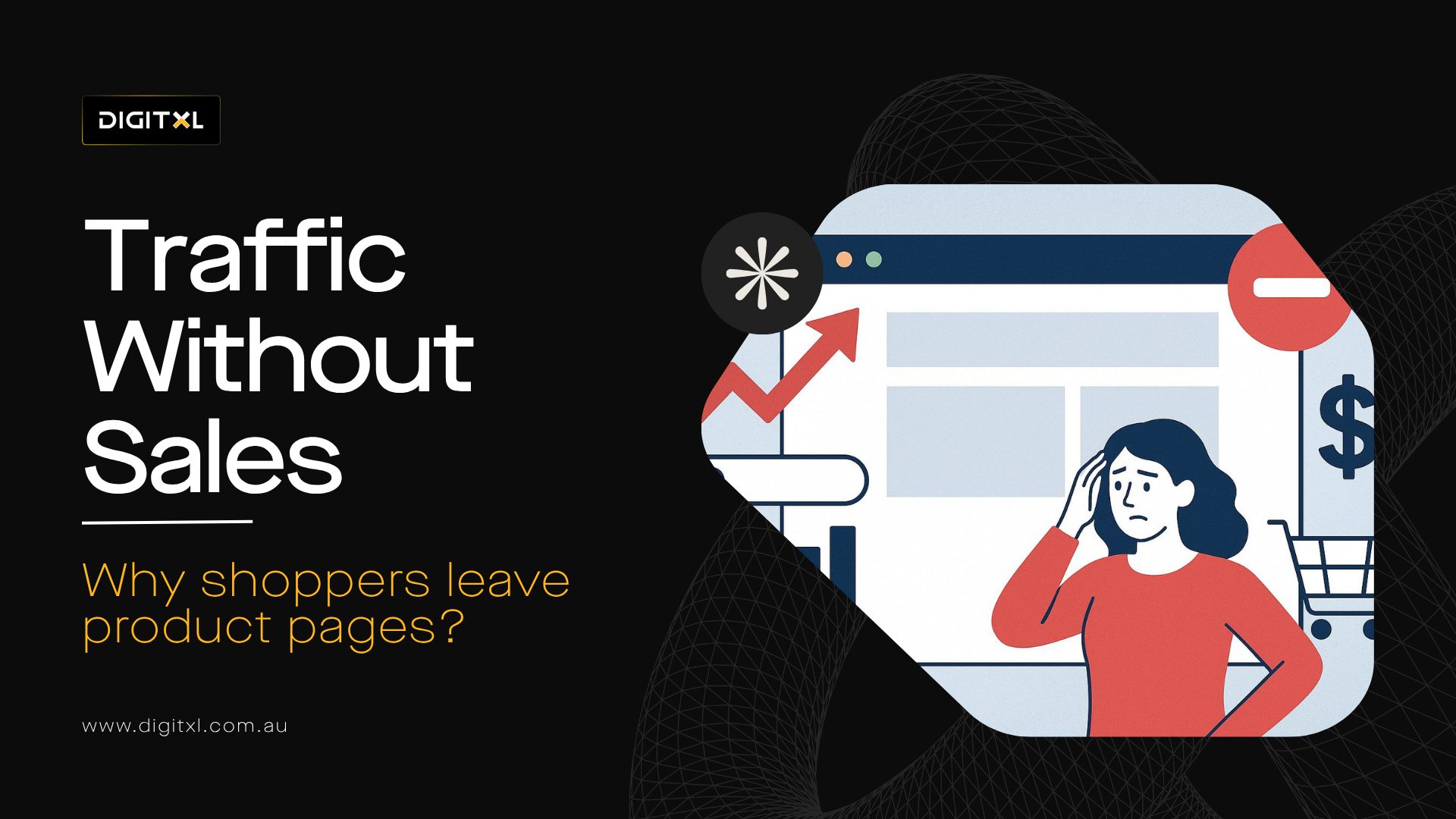
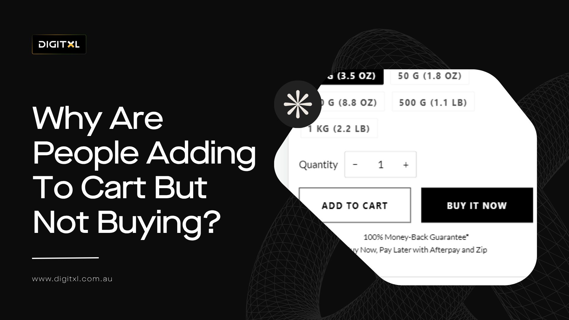
Why do product pages get traffic but no sales?
Many ecommerce businesses do not have a traffic problem. They... Read more