- CRO
Designing for Cognitive Load: How to Prevent Mental Fatigue in Users
24 Sep 2024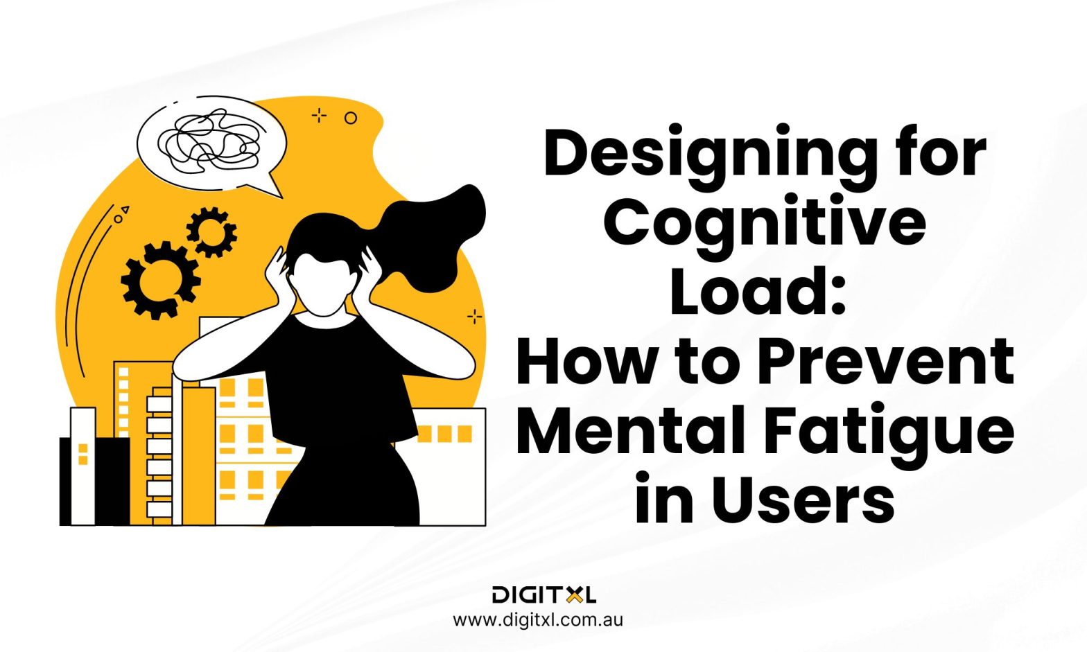
Can you read while listening to music? If you can, then that’s something interesting! But for a simpleton like myself and many others, having too many stimulations at a time can be overwhelming..
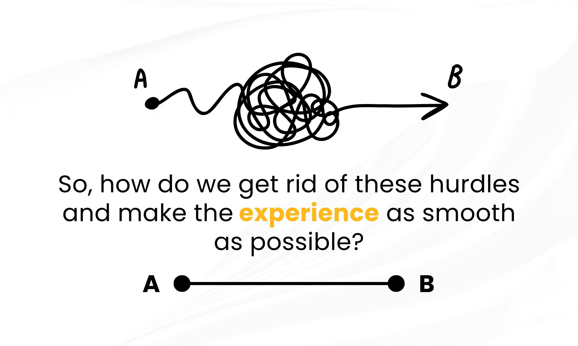
Can you read while listening to music? If you can, then that’s something interesting! But for a simpleton like myself and many others, having too many stimulations at a time can be overwhelming.. that’s exactly how users feel when they’re faced with confusing interfaces and information overload. They’re trying to get from A to B, but your design keeps throwing obstacles in their way.
2. Let’s stop ignoring the brain: Why cognitive load matters
It’s crazy how much we talk about “user-friendly” designs but forget that real users have real brains. Cognitive load isn’t a fancy term rather the mental weight users carry when they’re interacting with your product. Too much of it, and they’re out. Literally, they’ll leave your site. Our goal is to make their experience as lightweight as possible, but how? Google sees that its search results page is uncluttered, focusing on relevance and simplicity. There are ways to reduce cognitive load by simplifying and prioritising content.
3. Design for lazy brains: Know the 5-second rule
We all have lazy brains, and that’s okay! The average human attention span is about 8 seconds beating a goldfish. If your users can’t figure out what to do in 5 seconds, you’ve lost them. Instead of bombarding them with information, make every second count:
- Visual anchors: Your user’s eyes are looking for a place to land. Use bold, clear focal points to guide them. Think of it like leaving breadcrumbs for birds, but digital.
- Less is more, seriously: Skip the fluff and keep only what’s essential on the main screen. Don’t make them think, and definitely don’t make them scroll through a novel. These are some tips to reduce user cognitive load effectively.
4. Rethink navigation: The science of not getting lost
Navigation is like a psychological map. Most users navigate with mental maps meaning they build a “map” in their heads of how your site or app is structured. But what happens when their map doesn’t match yours? Chaos. Here’s how to make sure everyone’s on the same page
- Semantic design: Use terminology your users already know. “Dashboard” is familiar. “Command Center for All Your Data Needs” is not. Don’t try to reinvent the wheel.
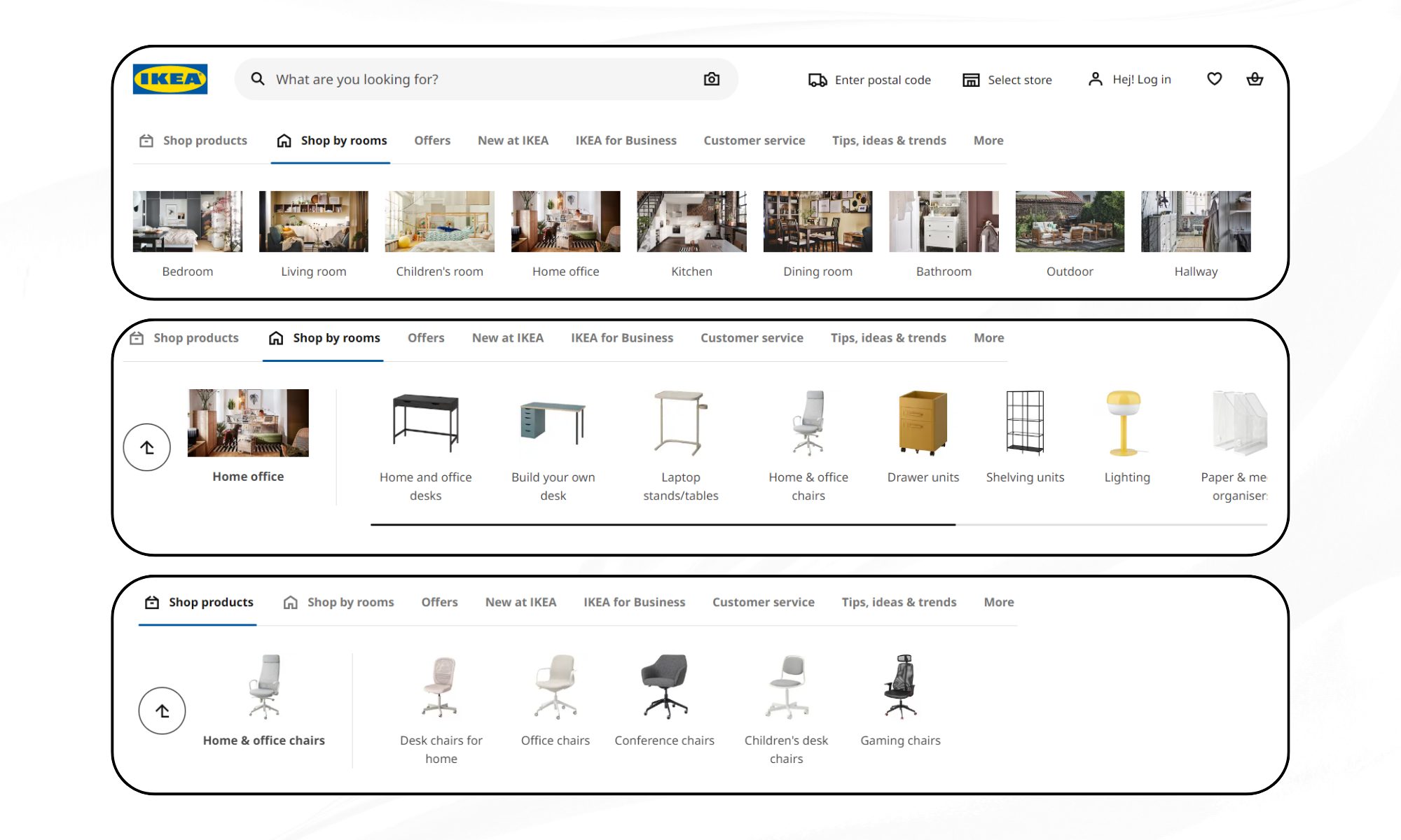
- Signposts and pitstops: Give users clear signposts, like a fixed menu, and pitstops, like content previews, to reassure them they’re on the right path. IKEA’s website uses intuitive category names and breadcrumbs to help users navigate its vast catalogue without feeling overwhelmed.
5. Break the “Invisible Interface” myth: Subtle isn’t always better
There’s this myth in UX that the best interface is an invisible one. That’s nonsense. You want to be clear and upfront. If users can’t find it, it might as well not exist. Here’s how to be bold without being annoying:
- Visual cues, not visual noise: Highlight interactive elements with micro-animations or subtle highlights. Think of it like nudging someone’s elbow, not tapping their face.
- De-clutter, don’t sterilise: Minimalist design doesn’t mean empty. It means deliberate. Use bold colour for CTAs and don’t be shy about adding a bit of flair.

6. Multisensory design: Tapping into more than just sight
Why stop at visual cues? Use multisensory design principles to create richer, more memorable experiences:
- Haptic feedback: Give users a little vibration or tactile response when they perform key actions. It’s a tiny thing, but it creates a much more satisfying experience.
- Sound cues: Subtle audio can reinforce actions. Ever notice how the ‘ping’ sound on Slack makes you feel like you’ve accomplished something? That’s dopamine, and your design can trigger it too.
7. Interactive storytelling: Turning tasks into experiences
Users are storytellers by nature. They want to feel like they’re going on a journey, not just clicking buttons. Here’s how to turn boring processes into engaging stories:
- Gamify the experience: Reward users with points, badges, or progress markers. Even if they’re filling out a form, make it feel like they’re levelling up in a game.
- Narrative design: Use microcopy that speaks directly to the user. Instead of “Submit Form,” try “Let’s Get This Show on the Road!”

8. Use Cognitive Science: Beyond the basics
We often hear about “designing for the user” but what if we designed based on how the human brain actually works? Let’s see some less talked about cognitive principles:
- Cognitive biases: Use known biases like the “peak-end rule” – people remember the peak and the end of an experience best. Make sure your product has a memorable highlight and a satisfying conclusion.
- Cognitive offloading: Let users offload mental effort by integrating features like autocomplete or pre-filled fields. The less they have to think, the more they’ll love you.
9. Beyond accessibility
We often think of accessibility in terms of physical disabilities, but what about cognitive ones? Designing for neuro diversity can actually improve the experience for everyone:
- Simplified language: Use plain language without dumbing it down. Avoid jargon unless you’re absolutely sure your audience understands it.
- Consistent patterns: People with ADHD or autism spectrum disorders often find inconsistent patterns confusing. Make sure your design flows predictably.
10. What top brands do differently
So, what are the global giants doing that you aren’t? Let’s take a look:
- Netflix: They’ve mastered the art of “Progressive Disclosure.” You’re shown just enough information to make a decision but can always dive deeper. Think of how they organise genres; they are all chunked and easy to navigate.
- Duolingo: They’ve turned learning a language into a game, using bright visuals, sounds, and rewards. They’re minimising cognitive load while making it fun.
- Tesla: Their car UI isn’t just a bunch of buttons. It’s a well-thought-out experience. Critical features are prominent, secondary ones are tucked away. Plus, the car learns from the driver, adapting over time.
11. Test, test, and test again!
Your job isn’t done once you’ve designed a cognitive load-friendly interface. It’s just beginning.
- Walkthroughs: Have users talk through what they’re thinking as they navigate your design. It’s the best way to spot pain points.
- Think aloud: Similar to cognitive walkthroughs but more spontaneous. Just let users think out loud as they use your product.
- Data-driven design: Use heat maps, click tracking, and other analytics to see where users are getting stuck. Numbers don’t lie.
12. Designing for cognitive load: Applying DIGITXL’s expertise
- Conversion Rate Optimisation: Through A/B testing, multi-variate testing, and user behaviour analysis, we help our clients optimise user journeys and increase conversion rates.
- Personalisation Solutions: Tailor user experiences with data-driven insights to deliver personalised content, recommendations, and offers.
- eCommerce Strategy Consulting: We provide expert guidance on A/B testing strategies, optimisation of user flows, and insights based on market research and trends.
- Customer Journey Mapping: We analyse and optimise every step of the customer journey with data-driven insights and user feedback.
- Advanced Analytics & Insights: We measure the effectiveness of tests and optimise strategies using advanced analytics tools and custom dashboards.
13. Think like a user, design like a human.
Designing for cognitive load is absolutely a commitment to respecting your users’ mental space. It’s about designing like a human for humans. It’s about creating an experience that says, “We get it, and we’ve got you.” So next time you’re faced with a design challenge, remember: less is more, clarity is king, and a little empathy goes a long way.
14. FAQ
1. What is cognitive load?
A. It’s the mental effort users need to interact with your product. Too much cognitive load can frustrate users and drive them away.
2. Why is cognitive load important in design?
A. Because users have limited attention and get overwhelmed easily. Reducing cognitive load helps keep them engaged and improves their experience.
3. How can I reduce cognitive load on my website or app?
A. Simplify content, use clear navigation, prioritize key information, and design with familiar terms and visual cues.
4. What is the 5-second rule in UX?
A. Users decide in about 5 seconds if your design is useful. If they don’t quickly know what to do, they’re likely to leave.
5. How do I know if my design is too complicated?
A. Conduct user testing like walkthroughs and think-aloud sessions, and use analytics tools to spot where users get stuck.

Recent Posts


What is Answer Engine Optimisation (AEO)?

What is Generative Engine Optimisation (GEO)?
Case Studies
Business News Australia
On Track Meals


