- CRO
10 CRO Tactics That Will Still Work in 2025
10 Apr 2025
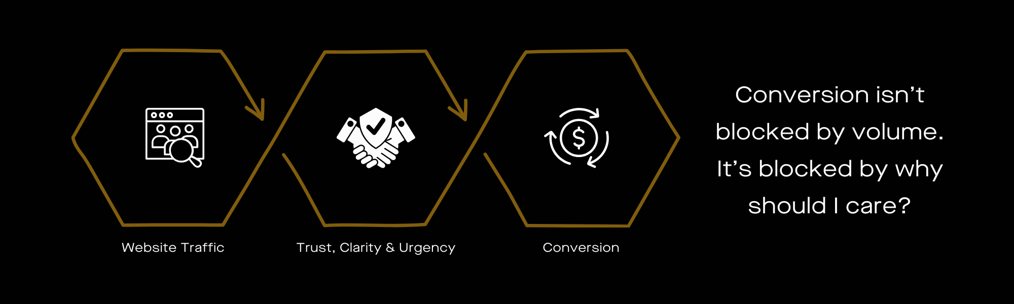
Most Brands Don’t Have a Traffic Problem—They Have a “Why the Hell Should I Care?” Problem
CRO isn’t about “nudging” users. If someone doesn’t convert, it’s because:
- They don’t trust you.
- They don’t understand why your offer is better.
- They have zero urgency to act right now.
Fix those, and your conversions go up. Ignore them, and no amount of A/B testing is going to save you.
Whether you handle optimisation yourself or work with a CRO agency, this is the foundation.
These are the Top 10 Conversion Rate Optimisation Techniques—non-obvious and rooted in real buyer psychology.
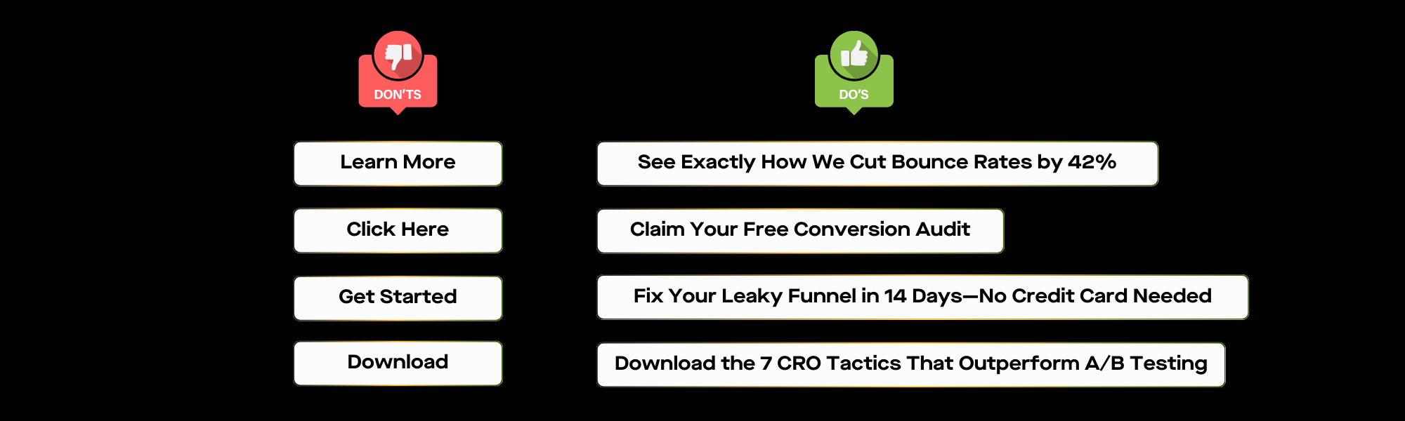
2. Your “Call to Action” is Too Safe. Make It Uncomfortable.
“Get Started.” “Book a Demo.” “Learn More.”
None of these make users feel anything.
A good CTA should:
- Make users think “I can’t afford NOT to click this”
- Make them feel like there’s a consequence if they don’t
- Be so specific that clicking feels like the next logical step
✅ Better versions:
- Instead of “Start Free Trial”, try “Test-Drive the Full Platform—No Limits for 14 Days“
- Instead of “Request a Demo”, try “See How [Competitor’s Name] Customers Are Switching to Us“
- Instead of “Get Started”, try “Stop Losing Customers to Slow Checkout Pages—Fix Yours Now.People don’t need a button to press—they need a reason to act.
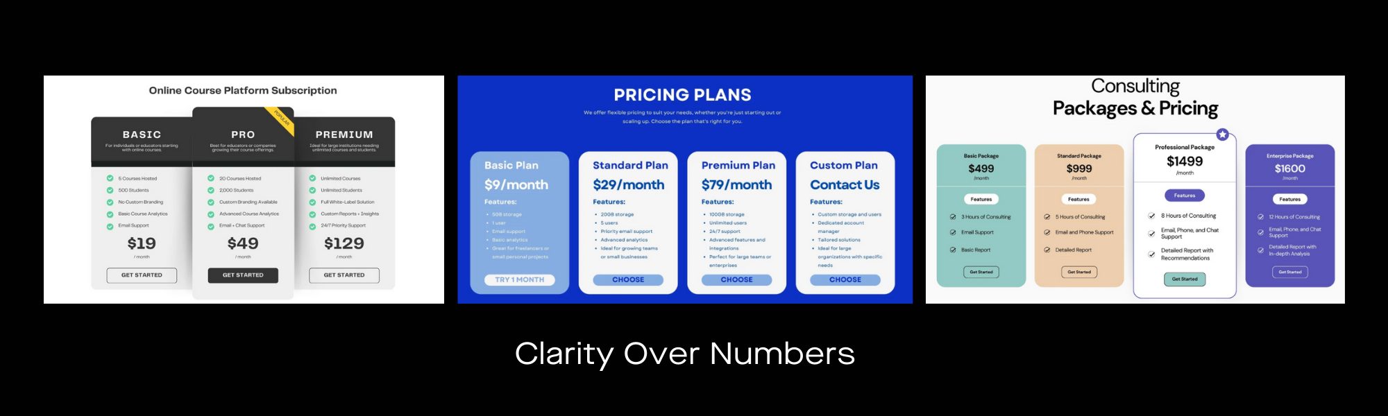
3. Your Pricing Page Isn’t Helping Anyone Make a Decision
Pricing pages aren’t about showing numbers—they’re about removing doubts.
If people hesitate, they’re asking:
- “Am I overpaying?”
- “What if I pick the wrong plan?”
- “Is this worth the hassle of switching?”
✅ Fix it with these tweaks:
- Pre-highlight the most popular plan—don’t make them guess.
- If your price is higher than competitors, justify it (e.g., “Includes X, Y, and Z that others charge extra for”).
- Add a “Need Help Choosing?” feature—this alone increases conversions by up to 40% in some industries.
This isn’t just one of the Top 10 CRO tips—it’s foundational to conversion optimisation.
4. If Your Form Looks Like Work, People Will Avoid It
People don’t hate forms. They hate forms that feel like effort.
✅ Here’s what fixes it:
- Remove unnecessary fields. Nobody wants to give you their phone number unless you convince them why it benefits them.
- Auto-fill as much as possible. Browser autofill, social logins—make it brainless.
- Break it into steps. A long form looks like a chore. A “Step 1 of 3” form feels easier.

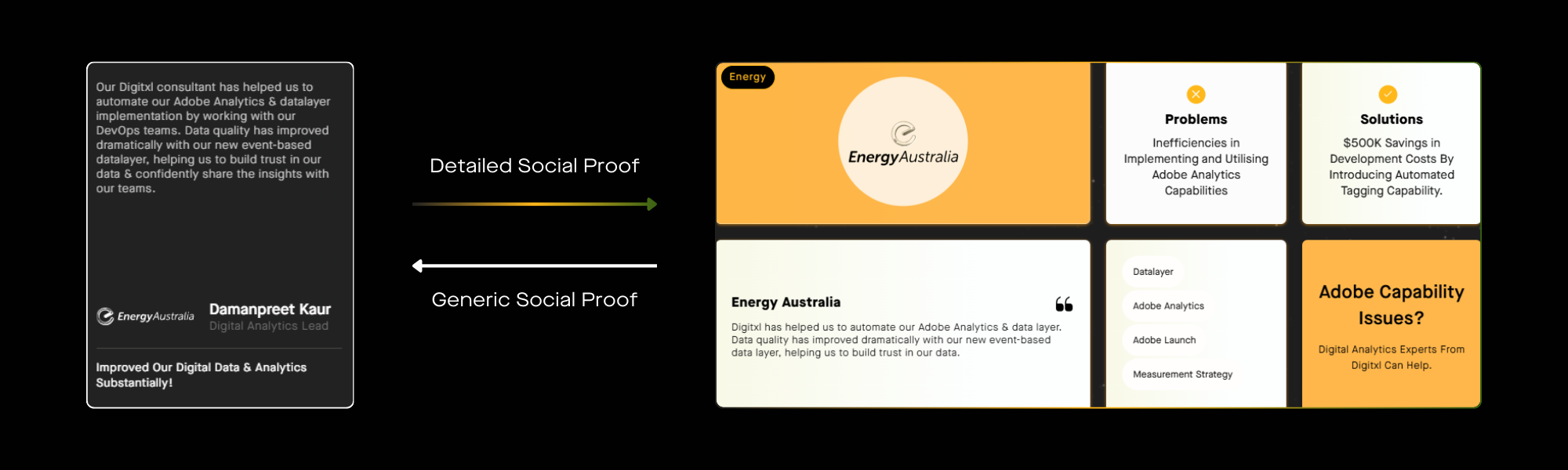
5. Your Social Proof Is Too Vague to Be Useful
Saying “Trusted by 10,000+ companies” means nothing if users don’t relate to those companies.
✅ Better approach:
- Show logos of brands your ideal customers recognise (not just any logos).
- Use social proof at key hesitation points (e.g., right before checkout).
- If you can’t get big-name logos, show industry relevance. E.g., “#1 Rated Tool for Australian Construction Firms.”
Example: Swap “Trusted by 50,000+ Businesses” for “Helping 1,400 Agencies Close Deals 3X Faster”— test it!
Social proof is not bragging right but about reducing uncertainty.
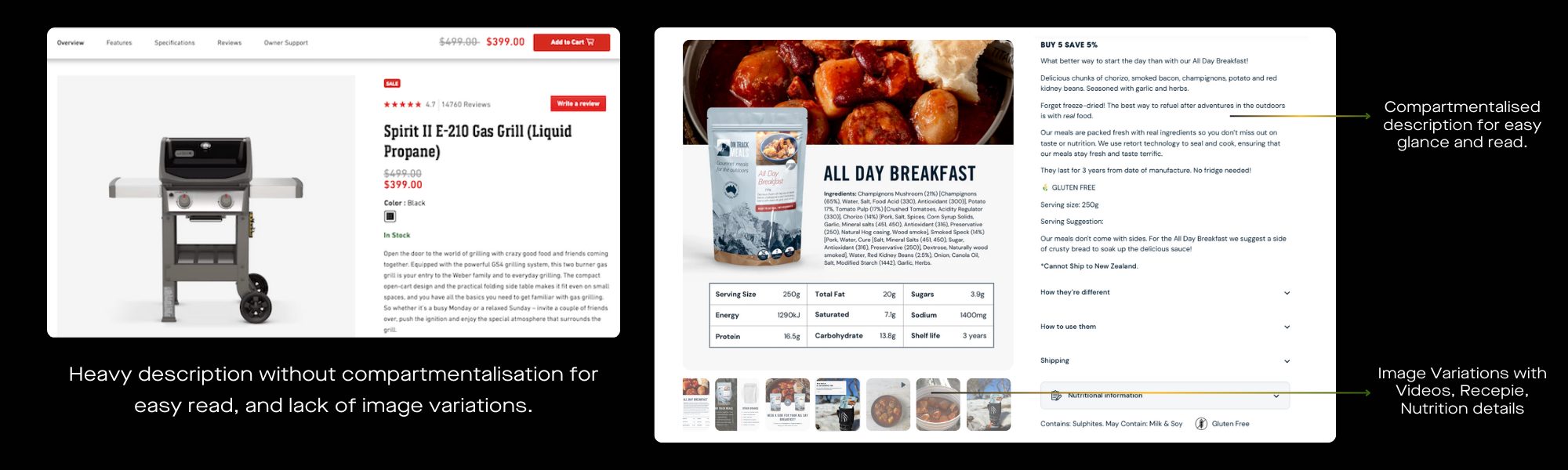
6. If Your Product Needs Explaining, You’re Already Losing
People don’t read landing pages. They skim. If your offer isn’t obvious in 5 seconds, they’re gone.
✅ How to make your product instantly clear:
- Use a short, powerful headline—not some fluffy “Revolutionising the Future of X” nonsense.
- Show, don’t tell. A short GIF of your product in action converts better than paragraphs of text.
- Cut your first three sentences in half. Most intros are too long.Example: You replaced a 3-paragraph explainer with a 5-second GIF of how the product works. Signups jumped overnight!
People need instant clarity than more information..
7. Stop Using Discounts. Use “Disappearing Bonuses” Instead.
Discounts attract the wrong buyers. Bonuses attract people who want value.
✅ Better alternatives to discounts:
- Instead of “10% Off,” offer “Sign Up Today and Get X Free” (extra seats, an add-on, priority support).
- Instead of “Limited-Time Discount,” offer “Exclusive Perk If You Buy Today” (but make it real).
Example: Replace a 20% off sitewide discount with “Buy Now, Get a Free Gift Worth $30”.

8. If People Leave Without Buying, Give Them a Reason to Come Back
Most abandoned cart emails suck because they only say “Hey, you forgot something!”.
✅ What actually works:
- Use dynamic urgency. “Your cart is reserved for the next 2 hours.”
- Remove friction. “One-click checkout—your info is already saved.”
- Personalised follow-ups. If they abandoned a high-value product, offer a personalised concierge call instead of a generic email.
Real tip: Make your abandoned checkout emails sound human instead of automated.. make a connection.
9. If You Have More Than 3 Pricing Plans, Cut One.
More choices = harder decisions.
✅ How to simplify pricing:
- Kill your least popular plan. If it’s not converting, it’s just adding decision fatigue.
- Highlight the default best choice—don’t make users compare endlessly.
- Offer one “safety net” option (e.g., “Not sure? Try [Low Commitment Offer]”).
10. If Your Mobile Site Loads in Over 3 Seconds, Forget Everything Else
Speed matters more than any tactic. If your site is slow, CRO doesn’t even begin.
✅ What to fix first:
- Lazy-load images. Don’t make users download everything at once.
- Kill unnecessary scripts. Check Google PageSpeed Insights and remove bloat.
- Test real-world load times. Not just in Lighthouse—on an actual phone, on actual 4G.

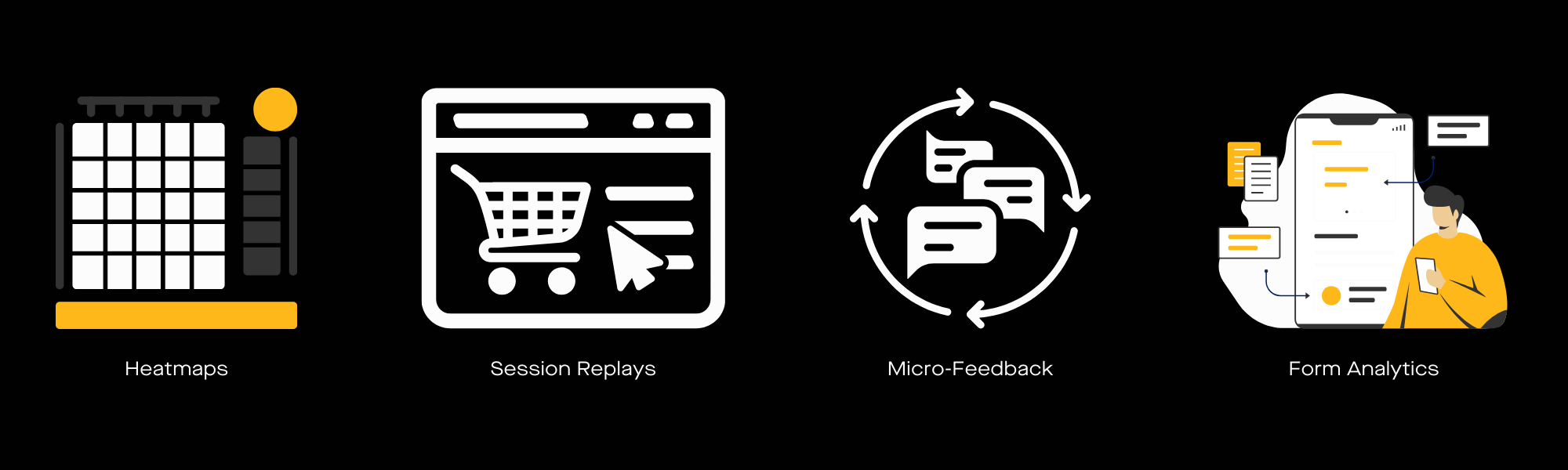
11. Fix What’s Actually Broken, Not What’s “Best Practice”
✅ What to do right now:
- Pull up your heatmaps and session recordings. Where do users hesitate?
- Fix one friction point this week. Track if conversions improve.
- Stop testing random things. Start fixing what’s actually stopping people from buying.
Conversion Rate Optimisation is about removing the real reasons people aren’t saying yes. Do that, and everything else takes care of itself.
Let’s talk about improving your website’s conversions!
13. FAQ
Q. Why do most brands have a conversion problem, not a traffic problem?
A. Because users don’t convert when they don’t trust you, don’t understand your offer, or don’t feel any urgency. If those are broken, no amount of extra traffic or “best practice” tweaks will fix the underlying issue.
Q. What makes a strong call to action (CTA) in 2025?
A. A strong CTA is specific, outcome-focused, and makes it feel costly to not click, rather than a bland “Get Started”. It should clearly link the button to a problem you’re solving, like slow checkout, lost leads, or wasted ad spend.
Q. How should I improve my pricing page for better conversions?
A. Treat your pricing page as a decision aid, not just a list of numbers, by highlighting a “most popular” option and justifying higher prices. Add elements like “Need help choosing?” or quick comparison hints so users feel confident they’re picking the right plan.
Q. What are some quick wins for forms and social proof?
A. Shorten forms, use autofill or social login, and break longer flows into simple steps so they feel effortless rather than like paperwork. Replace vague social proof (“Trusted by thousands”) with specific, relatable proof near hesitation points, such as testimonials or stats from similar customers.
Q. Which CRO areas should I prioritise first on my site?
A. Focus on what’s actually blocking purchases: slow mobile pages, confusing offers, overloaded pricing, and friction in checkout or forms. Use heatmaps and session recordings to spot real drop-off points, then test changes there before chasing minor “best practice” tweaks.

Recent Posts
Case Studies
Business News Australia
On Track Meals
Suncorp

